Ecommerce Conversion Rate: A Practical Playbook
What a “good” conversion rate looks like
Every store is different. Category, price point, traffic mix, and brand trust all matter. Across many datasets, retail ecommerce stores often sit around 2 to 3 percent overall, with higher rates on desktop and lower on phones. Food and beverage and essentials convert higher. High consideration items like furniture and luxury convert lower. Use the ranges as direction, then set your own targets by device and category.
Practical target: if you are at 1 percent, aim for 1.5 percent. If you are at 2.5 percent, aim for 3 percent. Small lifts compound when traffic and average order value grow.
Quick wins you can ship this week
- Make the next step obvious on mobile. One primary button per screen. Sticky Add to cart on product pages. Sticky Checkout in the cart.
- Show the price to my door. Display shipping cost, taxes estimate, and delivery date early. Offer a clear threshold for free shipping if you have one.
- Put reviews where the eye lands. Stars and a short quote near the price. Link to full reviews lower on the page.
- Guest checkout first. Let people buy without creating an account. Offer account creation after purchase.
- Reduce fields. Remove any form field you do not truly need. Autofill the rest.
- Offer at least two payment choices. Cards plus a fast wallet like Apple Pay or Shop Pay. Add BNPL if it fits your margin.
- Answer the top objections. Size and fit, ingredients or materials, warranty, returns, and shipping speed. Put answers within one scroll of the price.
- Speed audit. Ask your team to measure the largest element load time on a mid range phone. Aim to improve it.
- Recover abandoners. Send one helpful email or SMS with the exact items and a clear incentive if needed.
- Add chat where questions block purchases. Product pages, cart, and checkout.
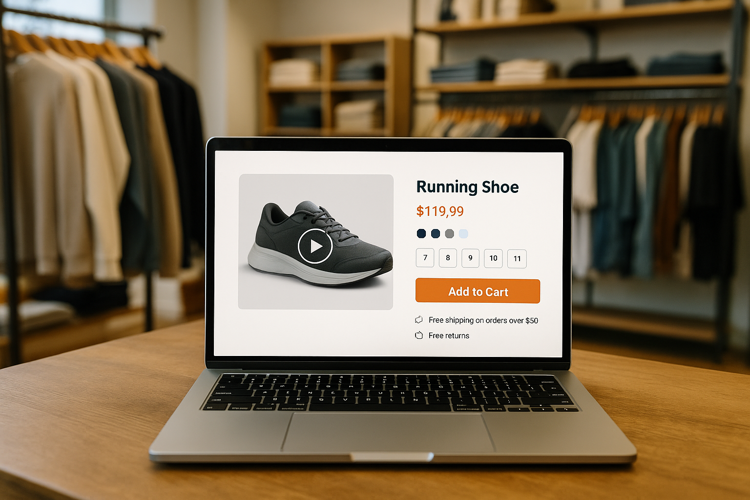
Product pages that sell
Your product detail page is where most buying decisions happen.
Must haves
- Strong images. Multiple angles, zoom, and at least one real life or scale shot. Short video is even better for motion, fit, and texture.
- Clear headline and price. If the product has a signature benefit, say it in plain words above the fold.
- Credible reviews. Show rating, count, and a sample review near the price. Mix in photos from customers.
- Trust signals. Returns window, warranty or guarantee, payment logos, and security. Keep it tidy.
- Sticky Add to cart. Keep the button visible as shoppers scroll.
Nice to have
- Comparisons. Help shoppers choose between popular options.
- Badges that actually help. Bestseller, staff pick, limited stock, or back in stock soon.
- UGC gallery. Curated customer photos or short clips.
Avoid
- Walls of text.Quick wins you can ship this week
- Make the next step obvious on mobile. One primary button per screen. Sticky Add to cart on product pages. Sticky Checkout in the cart.
- Show the price to my door. Display shipping cost, taxes estimate, and delivery date early. Offer a clear threshold for free shipping if you have one.
- Put reviews where the eye lands. Stars and a short quote near the price. Link to full reviews lower on the page.
- Guest checkout first. Let people buy without creating an account. Offer account creation after purchase.
- Reduce fields. Remove any form field you do not truly need. Autofill the rest.
- Offer at least two payment choices. Cards plus a fast wallet like Apple Pay or Shop Pay. Add BNPL if it fits your margin.
- Answer the top objections. Size and fit, ingredients or materials, warranty, returns, and shipping speed. Put answers within one scroll of the price.
- Speed audit. Ask your team to measure the largest element load time on a mid range phone. Aim to improve it.
- Recover abandoners. Send one helpful email or SMS with the exact items and a clear incentive if needed.
- Add chat where questions block purchases. Product pages, cart, and checkout.
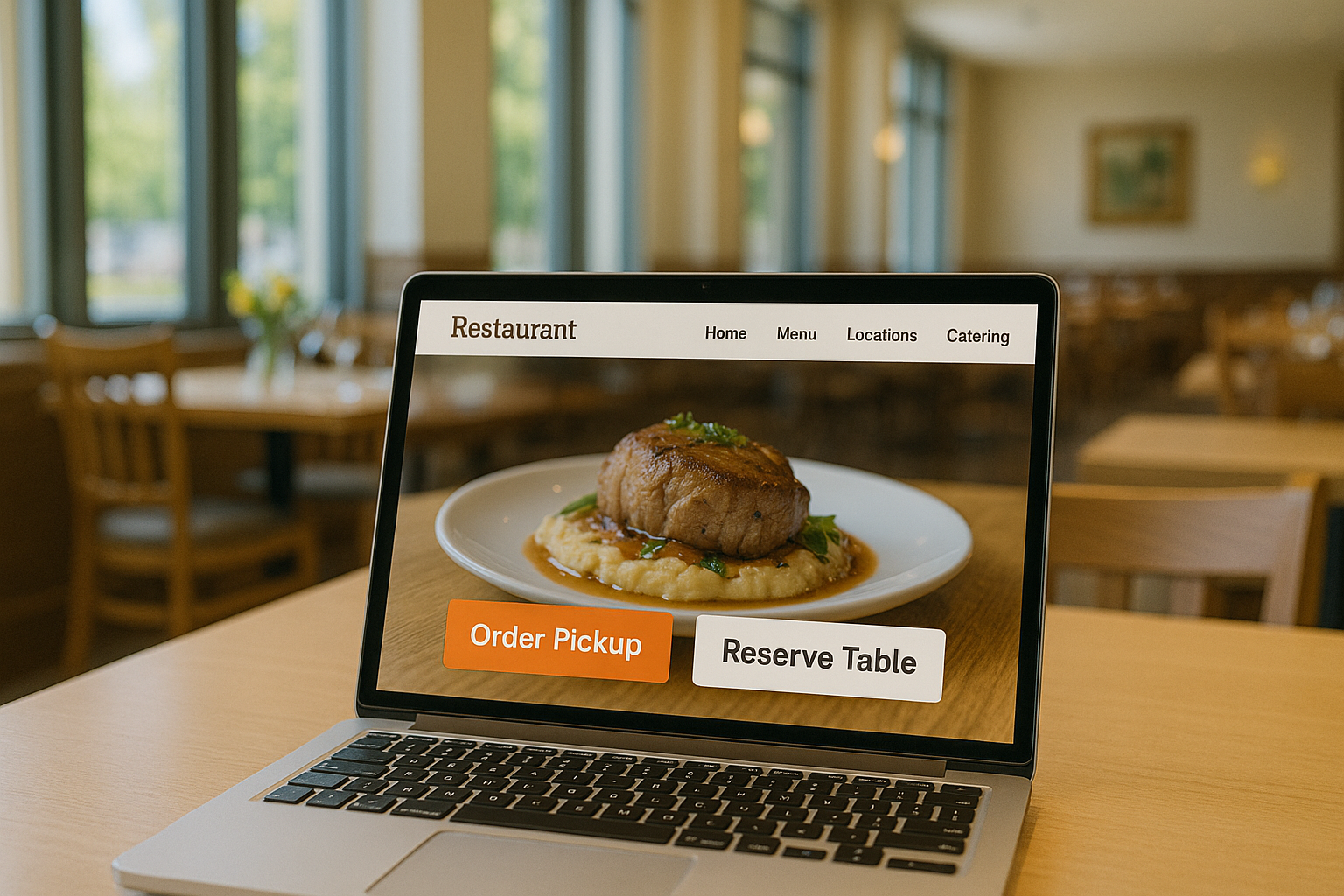
Checkout that never gets in the way
Checkout is where you lose the most money when it is messy. Keep it short and forgiving.
- Guest checkout up front. Offer social or email sign in as a side option.
- Ask for the minimum. Name, email, shipping address, shipping option, payment. Everything else is optional.
- Autofill and address lookup. Save typing on phones.
- Show total cost early. Taxes, shipping, discounts, and delivery date.
- Error messages in plain language. Say what went wrong and how to fix it.
- One time passcode for returning customers. Fewer passwords, faster repeat buys.
- Order confirmation that reassures. Clear next steps, tracking, customer service, and a sensible cross sell if appropriate.
Shipping and returns that build confidence
Shipping and returns policies change conversion. Be honest and specific.
- Free shipping threshold. Set a number that protects margin but still feels reachable. Show a progress bar in the cart.
- Real delivery dates. “Arrives by Tuesday” beats “Standard shipping.”
- Returns policy in simple words. Window, cost, and how to return. If you charge for returns, explain why and offer store credit or free exchanges.
- In store pickup or curbside. If you have stores, promote fast pickup for last minute needs.
Reviews and social proof
Reviews reduce risk and answer questions you did not think to cover.
- Get the first five reviews. They make the biggest difference. Ask recent buyers and make it easy to upload a photo.
- Aim for honest, mid to high scores. Perfect 5.0 looks fake. A mix of 4.2 to 4.7 with thoughtful replies can convert better.
- Reply to reviews. Thank happy customers and resolve issues in public. People read the replies.
- Highlight helpful quotes. Pull short lines that answer fit, quality, or sizing concerns.
Speed, mobile, and Core Web Vitals
More than half of orders now happen on phones. Slow pages cost sales. Ask your web team to watch three simple metrics in production: the time the main content appears, how quickly the page responds to taps, and how stable the layout is while loading. Set a goal to keep each in the green for the majority of visitors. Prioritize image compression, modern formats, lazy loading, and trimming heavy scripts.
Payments, BNPL, and price psychology
- Fast wallets. Apple Pay, Google Pay, and Shop Pay reduce typing and lift mobile conversion.
- BNPL. Useful for larger baskets and younger shoppers. Test carefully to make sure fees do not erase margin.
- Anchoring and bundles. Show the per unit savings or the best value bundle.
- Free shipping threshold. Pick a number slightly above your average order value so shoppers add one more item.
Personalization and lifecycle messaging
You do not need a heavy tech stack to be relevant.
- On site. Show recently viewed items, complementary products, or a small banner that reflects the visitor’s location or referrer.
- Email and SMS. Automations do the heavy lifting: welcome, browse abandon, cart abandon, post purchase, and win back. Keep messages short, visual, and helpful. Respect frequency.
- Offers by intent. New visitors get education. High intent visitors get urgency or reassurance. Returning buyers see loyalty or subscriptions.
Live chat and guided selling
Live chat helps when people are stuck. Place it where questions block purchases. Train agents to answer fast, link to the right product, and complete an order for the customer when needed. Measure response time, satisfaction, and the rate at which chats turn into orders.
Measurement plan and KPIs
Focus on a few numbers and review them weekly.
Funnel
- Product page views per session
- Add to cart rate
- Cart to checkout start
- Checkout completion rate
Economics
- Conversion rate by device and channel
- Average order value
- Revenue per visitor
- Return rate and reasons
- Contribution margin after fulfillment and payment fees
Experience
- Page speed on phones
- Review volume and average rating
- Chat response time and chat to order rate
Testing cadence
Run one clean A B test at a time. Start with product page headlines, images, price presentation, shipping messages, and the checkout button label. Roll out winners and document them.
FAQ
What is a good ecommerce conversion rate?
Many stores land between 2 and 3 percent overall. Your number will vary by category, traffic mix, and device. Track desktop and mobile separately and set device level targets.
How fast should my site be?
Ask your team to keep the main content visible in about two and a half seconds or less for most phone visitors, keep taps responsive, and avoid layout shifts as content loads.
Does free shipping always win?
It usually lifts conversion, but it must make financial sense. Many brands now use a higher free shipping threshold, charge for returns, or offer free exchanges to protect margin.
Should I add Buy Now, Pay Later?
It can lift conversion and average order value on bigger baskets. Test it on a subset of products first and watch fees and fraud closely.
How do I know if a change worked?
Use an A B test where half your visitors see the new version. If you cannot run a test, measure conversion, average order value, and revenue per visitor before and after the change with the same traffic sources.